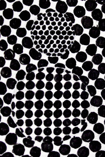
Illustrators working with just black ink have to employ various techniques to build up tone, such as cross hatching, repeating straight lines, scribbling, repeating dots (stippling) or circles in a grid or isometric pattern or even more loosely and randomly.
I like to play around with these in more experimental ways. Changing the size and thickness and direction of these tonal marks can suggest form or distance. I have played around with this quite a lot.
I'm very interested in what happens when you use these marks which are used to create the illusion of tone in a more abstract way. For example, using these instead of colour in the instance of colour field painting:
 |
| Kenneth Noland: Drought |
 |
| Mark Rothko: Black on Maroon |
These "colour fields" could easily be "texture fields" or "tonal fields" or "pattern fields". It's something I plan to play around with over the coming weeks.
I did some rough freehand gel pen drawings this evening to try out some 2 tone textured field drawings. I also played with them in photoshop to try seeing how colour might interact with them in various ways.


No comments:
Post a Comment